
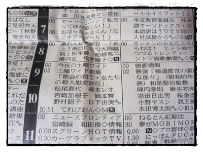
TV Listings in May 1992 Edition of Kitami Shimbun
Or, for those of you who didn’t know already… yes, nearly all of Sailor Moon‘s episode titles are the same length in Japanese.1
You wouldn’t really notice at first glance, but once you start reading through the titles, you’ll notice that the phrasing is a little off (i.e., some words seemingly forced in) or that kanji will be used or not used inconsistently, which just stands out. My original theory on the issue what that possibly it had to do with the fact that Japanese is typed in full-width, each character taking up the same amount of space (monospaced fonts2 are an example of this in English), and with balancing how much “white space” is taken up on the title card. But after reading into this a bit more, it looks like there’s a more specific reason for this.
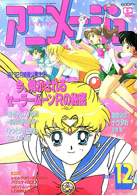
Dec. 1993 Issue of Animage
According to my research, Animage3 ran a column interviewing the staff who were producing the series and were able to get the scoop on why the titles seemed to be a near perfect match.
It turns out that the staff behind the Sailor Moon anime wanted their titles to fit in exactly in the space provided in the daily/weekly TV listings in the newspapers of the day4 and so they purposefully rewrote the episode titles to try to fit that character limit exactly. If you went over, it would be cut off (and viewers wouldn’t know what the episode was about) and if you went under, it would leave empty space. You can see in the example at the top of this post, Sailor Moon is the program starting at 7pm (incidentally, that’s episode 12), though the title was abbreviated here.
It’s pretty amazing to see that the staff actually went to such great lengths for such a small detail! In case you’re curious about the numbers, here they are:
| Total | <15 | 15 | 16 | 17 | 18 | 18< |
|---|---|---|---|---|---|---|
| 200 | 1 | 10 | 136 | 50 | 3 | 1 |

References:
- This is a Japanese reference, but since the point is about Japanese titles, that should be fine. See List of Sailor Moon Episode Titles (Wikipedia) ↩
- Courier is a common example of this. The monospaced/fixed-width nature of the font makes it easy to align text and is often used in coding for that reason. See Monospaced Font (Wikipedia) ↩
- The documents I found suggest that it was the November 1993 issue of Animage which contained this information, but the only article on Sailor Moon contained in there is concerning the upcoming Sailor Moon R movie. The December 1993 issue has a column on “Now Revealing 100 Secrets from Sailor Moon R” which seems the more likely candidate. I will update this once I’m able to get my hands on the actual issue ↩
- You kids today may not know, but back until the early 2000s, we literally had paper guides to tell us what was on TV and when. It seems so archaic, now that I mention it! ↩
I think another point might be the length of the title card melodies as well. it’s a specific short time, and maybe a similar amount of signs makes it sound better, more rhythmical in music, etc.